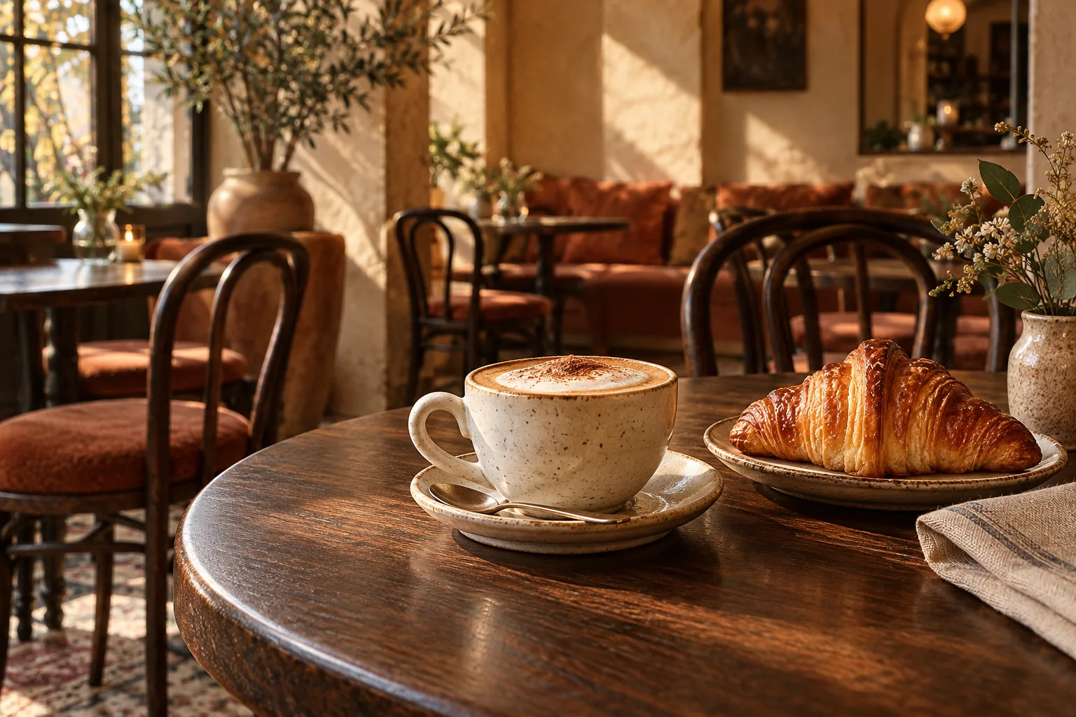
01 / Cafe Selected
Ember & Oat
A warm cafe identity with expressive editorial type, a photographed hero, filterable menu and a richly coloured story section.
Tactile / editorial / welcomingColour: Ember & Cream
Three independently authored designs: their own imagery, typography, section structure and identity. Compare full colour directions—not just different button colours.
These three studies include matching Home, About and Contact pages plus HTML/Astro ZIPs with bundled images. WordPress/Blogger versions and 25 independently designed templates per category have not been completed. The older Basic library remains a separate configurable foundation.
Select a colour or choose a design below. Preview and download will use the same selection.
These three authored pilots currently support HTML/Astro only. WordPress/Blogger adaptation is pending.
A warm cafe identity with expressive editorial type, a photographed hero, filterable menu and a richly coloured story section.
Tactile / editorial / welcomingColour: Ember & Cream
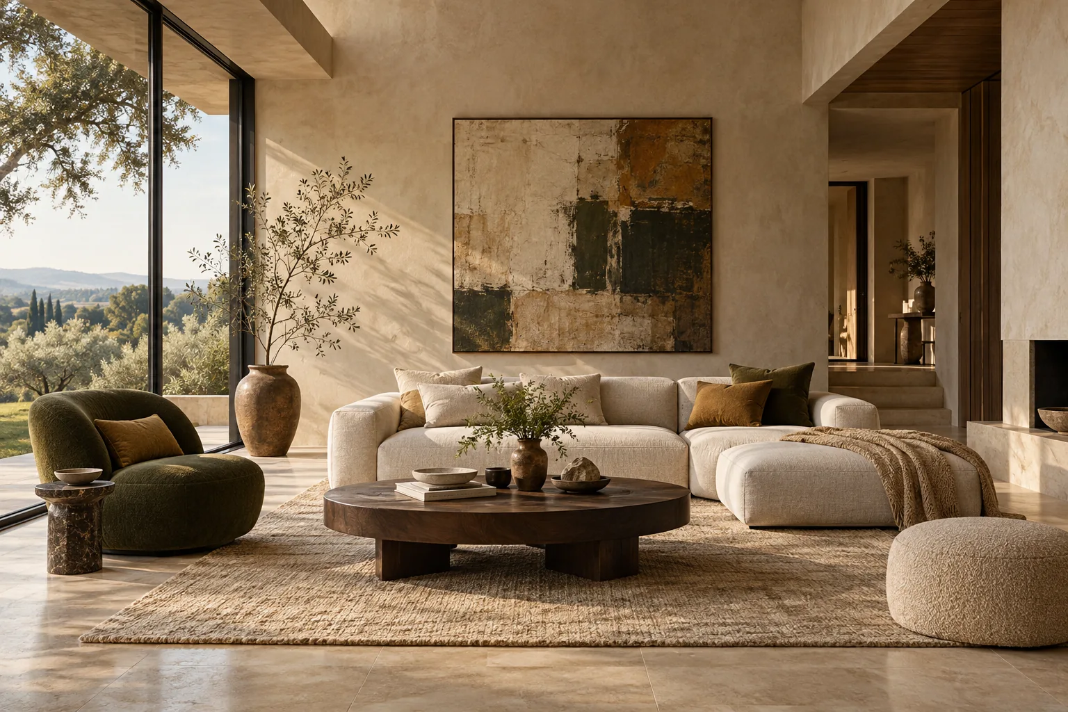
An image-led studio portfolio with a panoramic composition, oversized restrained typography, a material story and an editorial project brief.
Architectural / quiet / material-ledColour: Ink & Stone
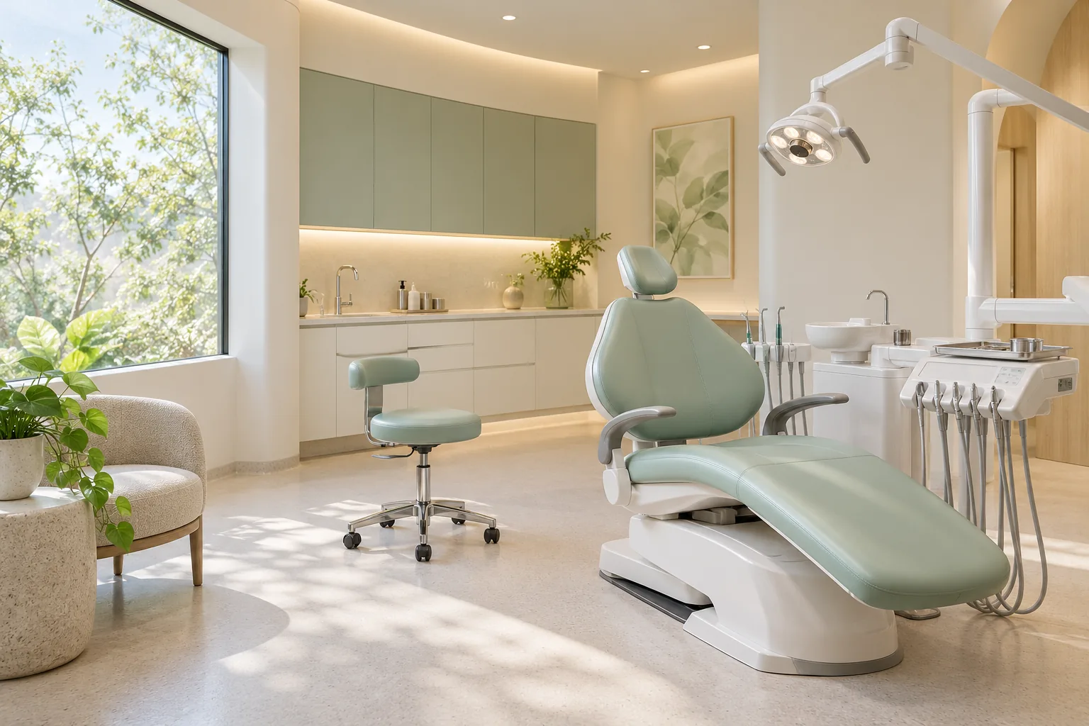
A bright care-focused identity with rounded geometry, an airy treatment-room image, clear service information and a calm first-visit journey.
Reassuring / spacious / approachableColour: Jade & Ivory
Images were generated for these fictional concepts and included locally in each ZIP. They are not photos of real client work, actual clinics or operating businesses. No fabricated testimonials or customer statistics have been added.